


Artificial Intelligence
Six Benefits of Open Source Software
6 min
The United Nations’ Sustainable Development Goals (SDGs) for the year 2030 were drawn up to make the world a better place for all. When it comes to monitoring progress towards the targets set, cartography has an important part to play. Well-designed maps make it possible to see and understand what’s going on and plan for action where necessary.
This is the second instalment in our series Mapping for a Sustainable World. If you haven't already, check out the first part, Geospatial data and the Sustainable Development Goals.
Designing a map involves several crucial steps. First, the cartographer selects data based on the map's purpose and specific requirements. Next, they identify the map's intended users and choose the most suitable medium (paper, computer, or mobile). The ensuing design process deserves careful planning to be successful in terms of visual representations.
This article will discuss 12 cartographic design decisions that must be made in the planning stage.
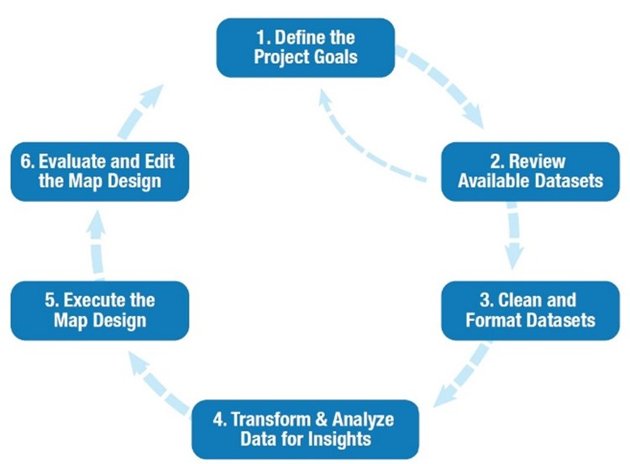
A general overview of the cartographic design process. Kraak MJ et al. (2020)
Projection in cartography involves converting three-dimensional Earth data into two-dimensional maps.
Cylindrical projections wrap the map around the globe, conic projections wrap the map around one hemisphere, and planar projections place the map on the globe.
All projections distort some map properties. Nonetheless, choosing the right projection for the map's purpose is important.
In the context of the SDGs, the primary concern when choosing a projection is finding a balanced and equitable representation for all countries depicted on the map.
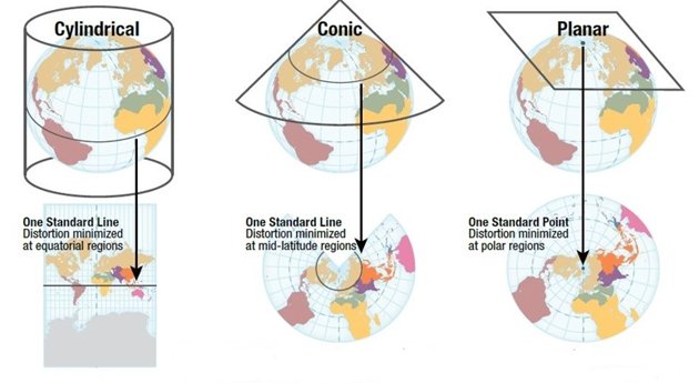
Three different types of projections. Kraak MJ et al. (2020)
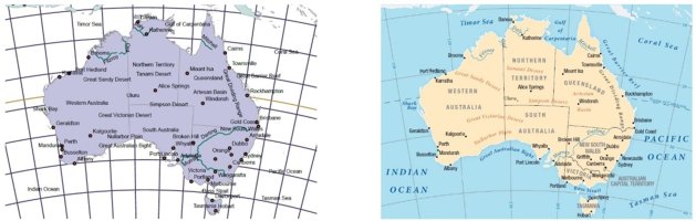
The central meridian of a map projection is the longitude around which the projection is focused, typically 0° at Greenwich.
Choosing a different central meridian can shift focus to a specific area and tailor the map to more local audiences.
This choice can clarify map features and spatial relationships and prevent broken linework.
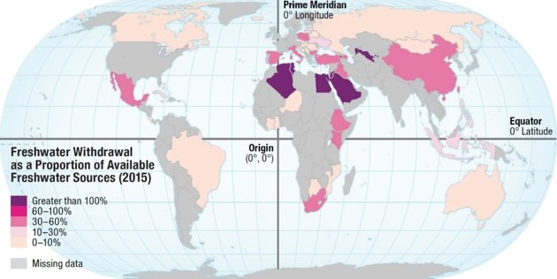
Projection centring. Kraak MJ et al. (2020)
Cartographic scale is about the relationship between distances on a map and distances in the real world. Scale is often shown as a ratio (e.g. 1:1,000,000, where 1 cm on the map equals 10 km in reality). It can also be expressed verbally (e.g. "1 cm equals 10 km") or graphically with a scale bar indicating a benchmark distance.
The subject and purpose of a map influence the appropriate scale. Cartographic scale is only accurate at specific points or lines and becomes more distorted at smaller scales.
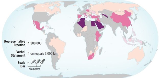
Indicators of scale. Kraak MJ et al. (2020)
Generalization in mapping is about simplifying details to make maps clear and useful for their intended purpose, audience, and environment. This process is especially important when moving from larger to smaller scales. Generalization is crucial for creating clear and effective maps that convey information accurately.
Generalization. Kraak MJ et al. (2020)
Understanding dimensionality is crucial for creating effective and accurate maps. Dimensionality is about the number of coordinates needed to specify the location of an object.
In vector data, geospatial features can be points (zero dimensions), lines (one dimension), polygons (two dimensions), or volumes (three dimensions).
Dimensionality is especially important in generalization, where features may change dimension to reduce visual complexity at different map scales.
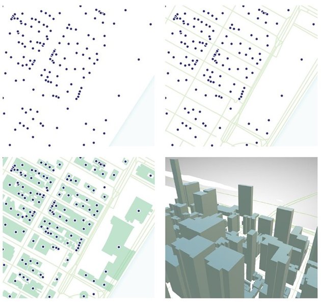
Top-left: Address location points (0D);Top-right: Street centre lines (1D).
Bottom-left: Building footprints polygons (2D); Bottom-right: Change to an oblique perspective to depict building heights (2.5D). Kraak MJ et al. (2020)
Symbolization in mapmaking refers to how data is visually represented on a map or diagram. Cartographers choose symbols carefully based on visual perception, cultural associations, and design conventions. These symbols are built from visual variables such as location, size, shape, orientation, and texture.
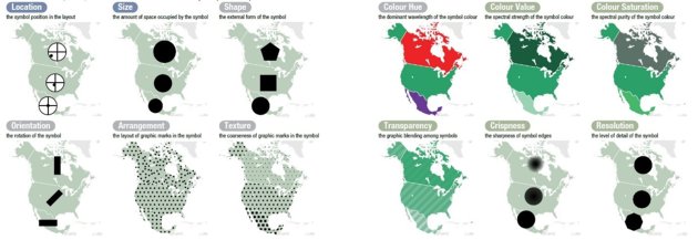
Visual variables and level of measurement. Kraak MJ et al. (2020)
Colour is the visual spectrum perceived by the eye. In map symbolization, colour consists of three main variables: hue, value, and saturation. Digital maps use the RGB colour model: red, green, and blue, while maps printed on paper use CMYK: cyan, magenta, yellow, and key (black). Choosing colours for maps can be tricky due to variations in appearance based on light source and individual perception.
Typography – i.e. style and placement of text – greatly influences how well a map communicates its message, making careful consideration essential for effective map design.
Labels are especially important for adding detail back into a map after generalization. While reference maps are densely labelled, thematic maps (such as those showing SDG indicators) have fewer labels because they focus on accenting important patterns.
To learn more about thematic maps, check out this article.
Autolabelling in mapping software vs. improved labelling. Kraak MJ et al. (2020)
Toponymy involves the origins, meanings, and cultural significance of place names. These names can be endonyms, originating from within the named place, or exonyms, from outside it.
Exonyms can sometimes carry colonial or culturally insensitive connotations, leading to contestation by local groups or communities. That's why cartographers should always consider the implications of using exonyms versus endonyms.
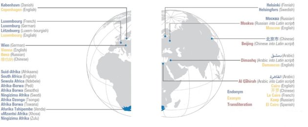
Toponymy. Kraak MJ et al. (2020)
The layout refers to how a map's elements are arranged on the page or screen, including the title, legend, scale, and the map itself. Within this layout, visual hierarchy directs attention to the map's most important features.
For the SDGs, the visual importance of different locations is based on the indicator data.
Overall, a well-designed layout and clear visual hierarchy ensure effective communication of the map's subject and purpose.
Layout: imbalance vs. a balanced, fluid layout. Kraak MJ et al. (2020)
Within the United Nations, cartography serves as a powerful tool for humanitarian efforts, especially when presenting complex SDG indicator data in an accessible way. While many SDG maps adopt a minimalist, neutral style to emphasize data accuracy, alternative creative styles can also promote awareness and stimulate action.
It's important to keep in mind that no map design is free from subjectivity, and what works in one context may not work in another.
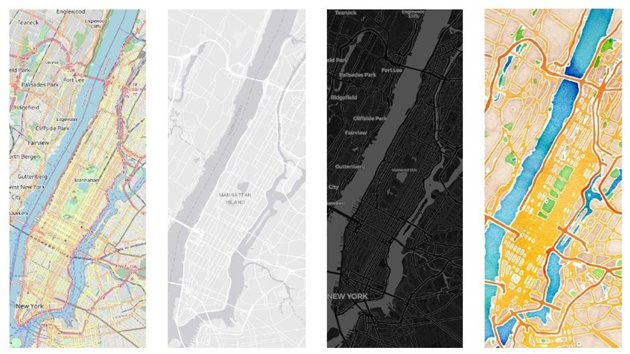
Visual styles in four web basemaps. Kraak MJ et al. (2020)
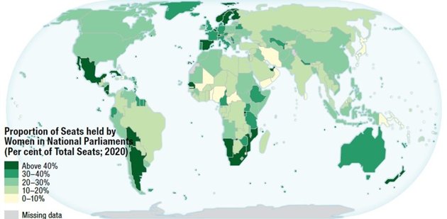
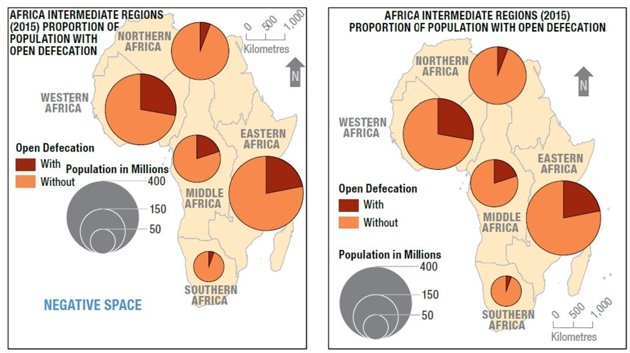
Missing data is a form of uncertainty, representing a gap between reality and the way the audience understands the map. In the context of SDG indicators, data for specific locations and years can be missing because data collection is incomplete or has only begun since the SDGs were launched in 2015.
To address missing data, previous years' data can sometimes be used. Visualizing uncertainty on maps helps convey data imperfections.
Missing data vs. zero. Kraak MJ et al. (2020)
This article is part two of our series based on Mapping for a Sustainable World. Come backsoon for the next instalment in the series, or check out part one, Geospatial data and the Sustainable Development Goals.
The content of this publication has not been approved by the United Nations and does not reflect the views of the United Nations or its officials or Member States
This article has been adapted from Kraak MJ, RE Roth, B Ricker, A Kagawa, and G Le Sourd. 2020. Mapping for a Sustainable World. United Nations: New York, NY (USA). The original work is an open access document according to the CC BY-NC license
Login and start learning!