Spatial Data Science
Podcast Interview: Debra Roberts on the True Meaning of Open Science
3 min
In this new instalment of our series based on Mapping for a Sustainable World, we look at different map use environments and considerations for map designers.
Maps can help us understand the world and the changes within it. This kind of understanding is crucial to anyone striving to achieve the United Nations’ Sustainable Development Goals (SDGs) for 2030. Cartography can therefore play a major part in meeting the SDG indicators as defined by the UN.
An important question for the cartographer is how a map will be used, also known as the map use environment. The use environment will place certain constraints on map design.
In this article, we discuss 13 different map use environments and some considerations that designers should take into account.
In the past, a single, static map served all users. Today, digital technology allows maps to be more interactive and to reach a greater audience. This requires tailoring maps to users with different backgrounds, interests, and needs.
For instance, general users probably need straightforward information, whereas specialist users might require tools to generate insights.
For map makers, it’s essential to carefully assess the needs of their intended users. They should also take into account cross-cultural sensitivity and inclusivity, especially when it comes to mapping the SDG indicators.
Map-makers should consider how usable their maps are for people with disabilities. Achieving maximum accessibility requires inclusive map design focused on improving the experience for all, with straightforward navigation and accessible colour schemes. Inclusive maps should also offer support for screen readers.
To accommodate visually impaired users, maps should have strong contrast, appropriate text sizes, and colour-safe schemes, avoiding combinations like red and green. There are also non-visual alternatives, such as tactile and sound maps.
Maps are increasingly used in highly interactive digital environments. For users, this means new opportunities to have dynamic conversations with their maps. They can request updates, customise maps, and tailor displays to their needs and preferences. In this sense, map users become map creators.
For interactive maps to be truly effective, a maximum amount of screen space should be reserved for the map itself, and visual clues should be clear and consistent.
When applied to the SDG indicators, interactive maps can help specialist users to explore multiple indicator datasets to generate new insights about global conditions.
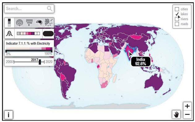
A map with interactive features. Image: Kraak et al. (2020)
Interaction operators are crucial building blocks of interactive maps. They enable users to manipulate map displays in various ways.
Depending on the map's purpose, different interaction operators can be implemented, such as reexpress (allowing users to switch between different types of thematic maps, for example), zoom, filter, and retrieve (allowing users to explore deeper layers of information beyond what's immediately visible on the map).
To avoid confusion or misleading information, map makers should only include operators that address specific user needs. Mapping the SDG indicators generally doesn’t require complex interactivity.
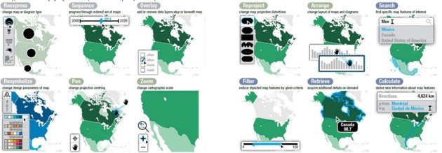
Interaction operators, with blue highlighting denoting the operator result. Image: Kraak et al. (2020)
The release of Google Maps in 2005 revolutionised web map design. Google Maps was the first of its kind to feature tile-based “slippy maps” that enable interactive browsing, panning and zooming.
Today, most web maps use open standards, such as HTML for content structuring, CSS for style, and JavaScript for interactivity.
Open sources and platforms such as SDG datasets and OpenStreetMap facilitate the collection and dissemination of the required data.
While web mapping is widespread, it's not yet available to everyone. SDG #9 aims to address this by setting a target for achieving universal and affordable internet access.
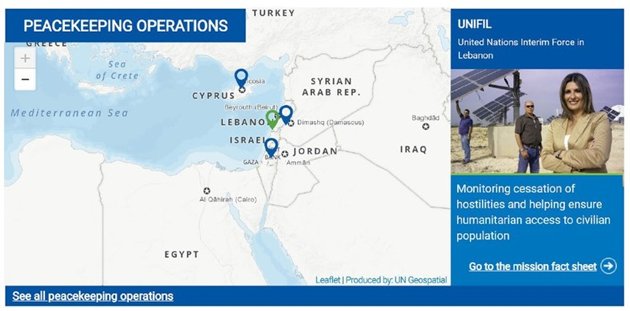
An example of web maps: the United Nations Clear Map. Image: Kraak et al. (2020)
Maps are among the most frequently accessed applications on mobile devices like smartphones and tablets. Mobile map design optimises maps to deal with the limitations of these devices, such as small screens, limited processing power, and unreliable connectivity.
Mobile maps are typically centred on the user's location, with the display automatically adapting as the user moves. Most mobile map designs are responsive, which means that the layout and content are adjusted between mobile and desktop devices.
In terms of the SDGs, mobile maps can contribute to geographic understanding of inequities, interdependencies, and alternatives.
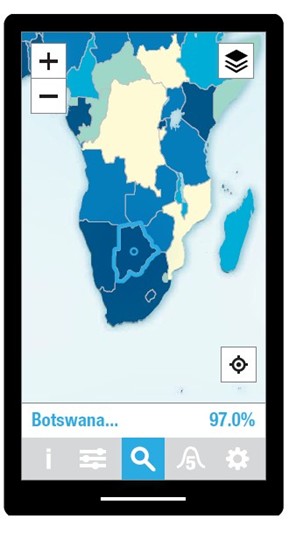
A mobile map. Image: Kraak et al. (2020)
Map-based storytelling is a superb way to engage audiences when it comes to communicating and promoting the aims of the SDGs. A story map presents information in a linear way. The story itself guides the audience through specific events, places, and people, while the accompanying narrative gives meaning and depth to the story.
The narrative often has three acts. It starts with a set-up to introduce the context, then highlights the main problem, and ends with solutions or recommendations, such as actions on the SDGs.
To effectively convey the desired narrative, storytelling in maps can take various formats, such as infographics, slideshows, or animations.
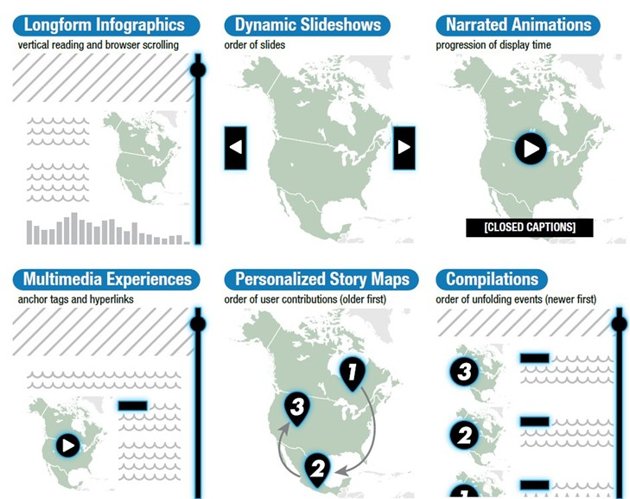
Visual storytelling genres. Image: Kraak et al. (2020)
Animation in cartography uses ordered sequences of frames to depict movement and change.
In the context of the SDGs, two kinds of animations are particularly useful: temporal and non-temporal.
Temporal animations show changes and trends over time, which allows for tracking the SDG indicators. Temporal animations can be complex and may cause viewers to miss details. To compensate, animation designers often add interactive legends and playback controls to their products.
Non-temporal animations order frames in such a way that map features become easier to understand, e.g., by progressively building the map one data class at a time.
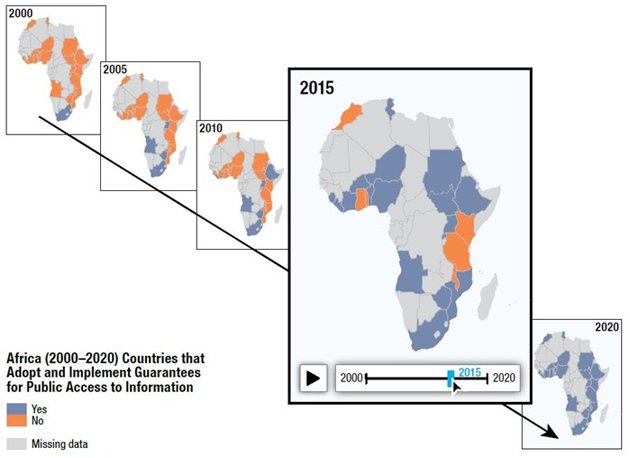
An animation providing temporal interaction. Image: Kraak et al. (2020)
Dashboards summarise data, often displayed as multiple maps and diagrams on one screen. They come in three categories: strategic, analytical, and operational.
A strategic dashboard offers an overview of key data (such as SDG indicators) for policymakers.
An analytical dashboard provides interactive tools for discovering insights across datasets. For the SDG indicators, analytical dashboards can help scientists and policymakers to discover and test new solutions to global problems.
Finally, an operational dashboard shows real-time data and alerts. Due to slower indicator data updates, operational dashboards are less suited for the SDG indicators.
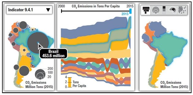
An analytical dashboard. Image: Kraak et al. (2020)
In exploratory cartography, interactive maps can generate new insights into geographic phenomena. Unlike traditional cartography, which focuses on presenting information clearly to a wide audience, exploration encourages specialist users to approach data their own way and come up with alternative views and theories.
Exploratory cartography involves using different data representations, zooming in on patterns, and retrieving relevant details. It's often supported by analytical dashboards and geovisual analytics.
In the context of the SDGs, exploration can produce new hypotheses about and potential solutions to the world’s social, economic, and environmental challenges.
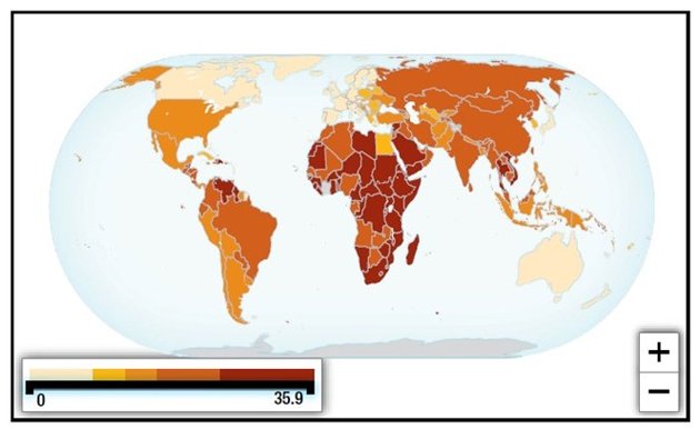
An exploratory overview map. Image: Kraak et al. (2020)
Atlases are structured collections of maps, text, and graphics illustrating geographic phenomena. They often focus on specific themes, time periods, or locations.
Atlas design depends heavily on the presentation medium and the intended audience. Print-based atlases generally present maps in carefully arranged two-page layouts (spreads).
Digital atlases can take different forms, such as a series of unique web pages or a set of map layers. They typically include interactivity and can also feature multimedia.
Creating an interactive atlas for the SDG indicators presents challenges but offers potential for supporting decision making, education, and advocacy.
This is about how design impacts the overall user experience. In the case of maps displaying SDG indicators, map designers should keep in mind that what’s usable for one local audience may not be so for another.
It’s also important to note that, in mapping projects, usability often competes with usefulness. Balancing these two factors benefits from a user-centred design approach with continuous feedback from intended users. This type of approach helps to refine both the map’s ease of use and functionality throughout the design process.
Open access refers to products freely available to use and modify, such as writing, datasets, maps, diagrams, and software.
It aims to democratize data collection and distribution, improve access to digital technologies, promote knowledge sharing, and encourage transparency.
In digital mapping, open access relates to Free and Open Source Software (FOSS) and open web standards such as HTML, CSS, and JavaScript. Open access can be free of cost ("gratis") or free to use, modify, and share (“libre”).
As SDG indicator datasets are both gratis and libre, they support global efforts towards sustainable development.
This article is part of a series based on Mapping for a Sustainable World. Check out our previous instalments, Seven Common Map Types for Sustainable Cartography and 12 Decisions When Designing Maps for the Sustainable Development Goals
This article has been adapted from Kraak MJ, RE Roth, B Ricker, A Kagawa, and G Le Sourd. 2020. Mapping for a Sustainable World. United Nations: New York, NY (USA). It has been adapted with permission from the authors in accordance with the CC BY-NC license
To view the original, follow the link below:
Login and start learning!