


Spatial Data Science
Podcast Interview: Debra Roberts on the True Meaning of Open Science
3 min
Cartography provides information to help understand trends and monitor progress towards the UN's Sustainable Development Goals (SDGs) for 2030. Depending on the purpose and requirements of the SDG indicators, mapmakers have several map types to choose from.
A thematic map shows the variation of one or more geographic phenomena by combining location information (the place represented in geospatial data) and attributes (the objects or groups of persons represented).
Thematic maps come in different types, with each type conveying a different visual metaphor. Choosing the appropriate thematic map type is guided by the nature of the data and the spatial patterns it should represent.
This article will describe seven commonly used thematic map types and their specific fields of application.
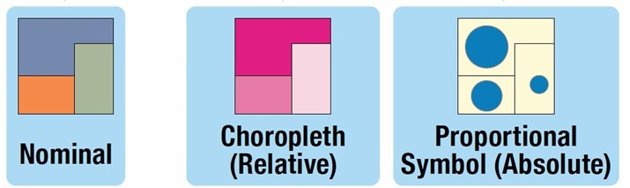
Some thematic map types often used for SDG mapping. Kraak MJ et al. (2020)
A nominal map shows categorical data using unordered visual variables. It can depict individual-level or enumerated data as points, lines, or polygons.
Nominal maps are helpful in representing specific SDG indicators, and numerical SDG indicators can be simplified into nominal values. Cartographers can choose this map type to show the mode of data within a certain area or to depict binary indicators (e.g., presence/absence). Sometimes, distinct colour schemes are used to highlight differences.

A binary nominal map. Kraak MJ et al. (2020)
The term "choropleth" is derived from the Greek words "chóros" ("place") and "plethos" ("quantity"). Choropleth maps are thematic maps representing quantitative, enumerated data.
This type of map shades areas based on their attribute values, using colour values to create visual order from light to dark or vice versa.
Choropleth maps are ideal for visualizing government activities and policies tied to political boundaries. They are popular in media because they are easy to make but also bring challenges. For instance, choropleth maps often oversimplify data by treating each area uniformly. Choropleth maps are also not suitable to display absolute values for an area.
Careful colour choice in this type of map is a must to accommodate colour vision deficiencies and differences in media reproduction.
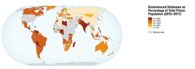
A choropleth map. Kraak MJ et al. (2020)
A proportional symbol map shows quantitative data by adjusting the size of symbols based on their values. This type of map facilitates numerical comparisons and is very useful for, e.g., displaying economic SDG indicators. Proportional symbol maps can depict either individual-level or enumerated data.
On the other hand, there are challenges, including symbol scaling, overlap, and the fact that people tend to underestimate the size of objects on maps.
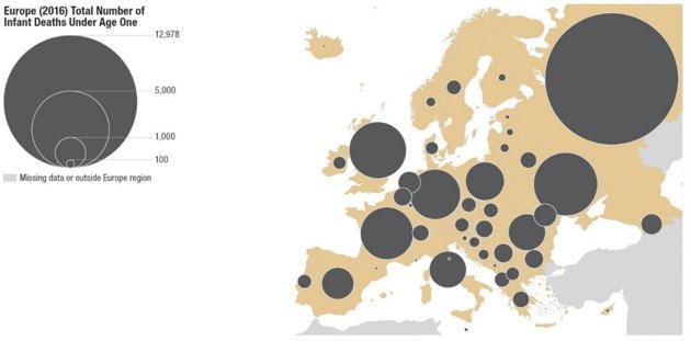
A proportional symbol map. Kraak MJ et al. (2020)
A dasymetric map is a thematic map that redraws borders of geographical areas using additional geospatial data. The aim is to better represent the distribution of a mapped phenomenon.
Dasymetric maps utilize two types of additional data: exclusionary, which defines where a phenomenon cannot exist (e.g. elevation or land cover), and inclusionary, which defines where a phenomenon can exist in different amounts (e.g. rural vs. urban zoning).
Unlike choropleth maps, dasymetric maps acknowledge the variability within separate areas. However, creating these maps on a global scale is challenging as data might not be equally available.
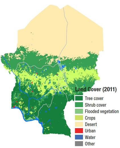
A dasymetric map representing four countries in Sub-Saharan Africa based on exclusionary data. Classified land cover processed from satellite imagery is used to identify areas where people do not live: desert and water. Kraak MJ et al. (2020)
A bivariate map shows two data attributes at the same time, offering insights into their spatial relationship. These maps can be helpful in understanding patterns and identifying irregularities.
However, their complexity can also lead to misinterpretation, all the more so because bivariate maps are rarely used in popular media. Correct interpretation can be promoted by complementing maps with properly constructed legends with X- and Y-axes.
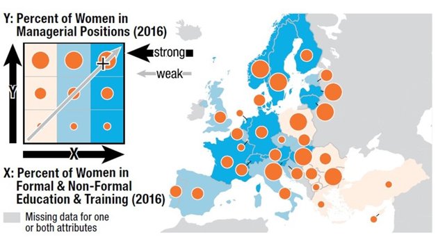
A bivariate map. Kraak MJ et al. (2020)
A cartogram is a thematic map that scales each area by its attribute value. By intentionally distorting the size, shape, and/or boundary relationships of areas, cartograms challenge preconceived notions and encourage critical spatial thinking.
Contiguous cartograms maintain topology while compromising on shape, while non-contiguous ones maintain the shape but create gaps between areas.
Unlike proportional symbol maps, where symbols are placed at the centre of each area, cartograms scale the entire area. Cartograms can also be shaded by a second variable to create bivariate maps.
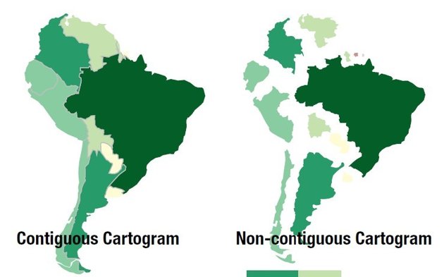
Contiguous and non-contiguous cartograms of South America. Kraak MJ et al. (2020)
Time is implicit in all maps, but not all maps are maps of time. For instance, SDG maps often present merely a snapshot, whereas truly understanding relevant SDG trends requires maps showing multiple time points or intervals.
With each additional time point or interval making the process more complex, representing time on maps requires creative solutions. Three primary approaches include:
- Adjacent maps, separating a time series into different maps.
- Coincident maps, single maps that use visual variables such as colour to represent changes over time.
- Animations that provide an overall sense of trends.
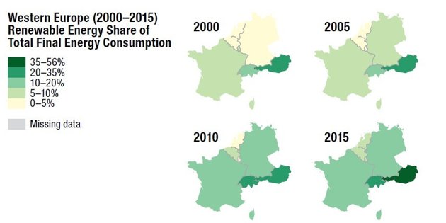
Adjacent maps. Kraak MJ et al. (2020)
This article is part of a series based on Mapping for a Sustainable World. Check out the next instalment in the series.
This article has been adapted from Kraak MJ, RE Roth, B Ricker, A Kagawa, and G Le Sourd. 2020. Mapping for a Sustainable World. United Nations: New York, NY (USA). It has been adapted with permission from the authors in accordance with the CC BY-NC license
To view the original, follow the link below:
Login and start learning!