


Spatial Data Science
They Have to Pick the “Most Successful” Species… It Gets Messy || ES.1 - Dr. Geo
29:18
With today’s easily accessible technology, practically anyone can make their own maps. However, since maps are more than neutral visualizations, a critical cartographic perspective is more important than ever.
Making maps used to take a lot of time and manual labour. Things started to change with the arrival of the first cartographic software, such as Freehand, in the late 1980s. The pen gave way to a computer mouse, the notepad to a spreadsheet. However, mapmakers still had to go through all the traditional steps, from collecting data to creating the final product. This necessity allowed them to keep an overview of the entire process and make deliberate choices at every step. At the same time, it meant that mapmaking remained the preserve of a select group with access to and knowledge of the tools.
In recent decades the process of mapmaking has gone through drastic developments due to innovations in software and hardware, and increased data availability. With the rise of GIS (geo-information systems), the cartographer's toolbox has expanded enormously. Agreements about making data available online have ensured that an ever-expanding wealth of data has become publicly accessible. Furthermore, all kinds of systems have been developed to automate the steps in the map-making process – such as linking statistical data to spatial elements, and choosing classifications and colour schemes.
Nowadays, anyone with a computer and internet access can make maps. This doesn't make everyone is a cartographer though. Cartography is more than the technology of making the maps, it's first and foremost about communication using maps. Consequently, there is still a need for specialists who know how cartographic communication works – and how to adapt a map’s visualization to its purpose. The huge amount of cartographic material and the speed with which it can be distributed lead to new challenges in which a critical cartographic perspective is indispensable.
Mark Monmonier, author of the classic How to Lie with Maps (1991), argues that despite groundbreaking technological innovations, the role of the cartographer is more relevant than ever. This is mainly because the basic characteristics of maps hasn’t changed. A map is a "credible representation of reality," Mormonier said, "and people tend to have strong faith in maps." Map users aren't really interested in how their maps are created. For example, they don't wonder about the quality of the underlying data, or about the analyses, aggregations and generalizations that were carried out to arrive at a particular map. Another important issue is the effect that maps have on their users. What message does a certain map convey? Have conscious choices been made to convey exactly this message? To what extent does the map influence the perception and behaviour of its user?
In the Netherlands, liveability in (urban) neighbourhoods has been a hot topic in political and social discussions since the 1990s. In 2005, the Dutch government introduced the “Rotterdam Act”, which gave municipalities the opportunity to selectively allocate homes in neighbourhoods where the quality of life is under pressure. As the Rotterdam Act was soon criticized for arbitrariness in the selection method, a specific method was developed to measure and monitor the quality of life in neighbourhoods; the “Leefbaarometer”.
The Leefbaarometer (figure 1 below) estimates the quality of life based on 96 characteristics of the living environment, mainly based on microdata from the Dutch Central Bureau of Statistics. These 96 characteristics are weighted and combined into one liveability score on a 9-point scale for each postal code area. In the next step they are aggregated into neighbourhoods, districts and municipalities. The data can easily be consulted and downloaded via a web viewer.
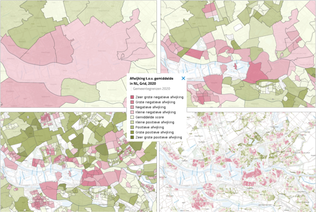
Figure 1: Leefbaarometer: liveability as a deviation from the Dutch average
The intuitive map images and easy accessibility of the indicators make the Leefbaarometer a frequently used tool. But there is also criticism. For one thing, the method’s apparent simplicity can cause the influence of scale and aggregation levels to be overlooked. In addition, liveability is a highly subjective concept, which makes the quality of life in neighbourhoods a complex issue. Underneath the results generated by the Leefbaarometer is a whole world of data collection and analyses, where choices are made based on scientific, political and pragmatic arguments. Although these choices have been thoroughly substantiated in a 185-page report, policymakers mainly look at the end product – the maps with clear green shades where things are going well, and red where the quality of life is in trouble. This may lead to extra policy attention being paid to a particular neighbourhood. But it can also cause further restrictions on availability of suitable housing for vulnerable groups.
Modern technology enabling anyone to create professional looking maps does not automatically ensure a commensurately high content quality. The communication process involved is way too complex for that.
Cornelis Koeman, the first professor of cartography at Utrecht University, described this during his inaugural speech in 1969 as: 'How do I say what to whom' (figure 2 below).
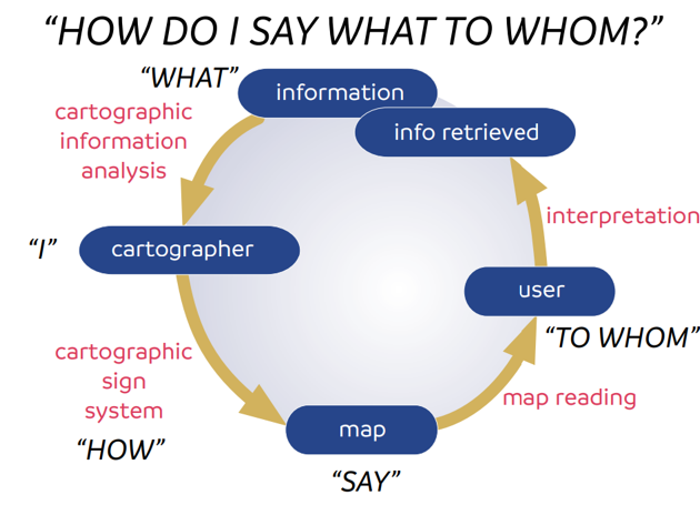
Figure 2: Model "How do I say what to whom?" . Source: Koeman
To begin with, you should analyse the subject matter, to ensure that the message (“what”) is based on the right choice of data sources and analyses. The user ('to whom') must interpret what the map 'says'. Therefore, you must take into account the process of visual perception: how the brain processes the stimuli received through the eyes into information. The physiological part of that process is largely known, although abnormalities such as color blindness can lead to unexpected results. But once processing begins in the brain, things get really tricky.
First, there is the “pre-attentive early perception,” which occurs unconsciously. The brain automatically starts interpreting and ordering, and, for example, “automatically” will order symbols that differ in size. Then there is “late perception,” which takes place more consciously and is based on attention, knowledge and memory. It's therefore important to take into account the expectations and prior knowledge of users.
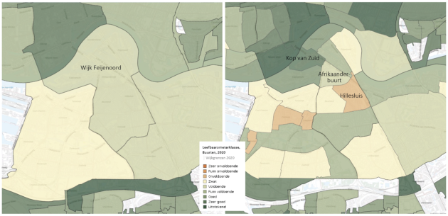
Figure 3: Leefbarometer scores at district (left) and neighbourhood level (right)
It's therefore important for map makers to take the expectations and prior knowledge of the users into account. Figure 3 above shows an example of how this can play a part in the choice of colour. A “satisfactory” score is green and therefore seemingly positive, but in fact the neighbourhood depicted here has a quality of life score that is well below the Dutch average. A neighbourhood that scores “insufficient” is red. This evokes the (negative) association of danger in the brain, while it can be argued that such a neighbourhood actually needs (positive) attention. Map makers must take all this into account to ensure that map users are not misled. It’s basically a matter of following the rules of visual language (the “graphic grammar”) and always examining the resulting maps critically.
In this day and age, a core quality of cartographers is that they can provide critical comments on “fast” and other maps that increasingly influence (policy) choices and perceptions. This critical cartographic perspective must be based on knowledge of cartographic theory that covers all steps in the process – from data collection to final use.
Interested to know more? Check out this Geoversity video "Misled by Maps: How data visualisation shapes our stories"
Login and start learning!